On this page 8 sections
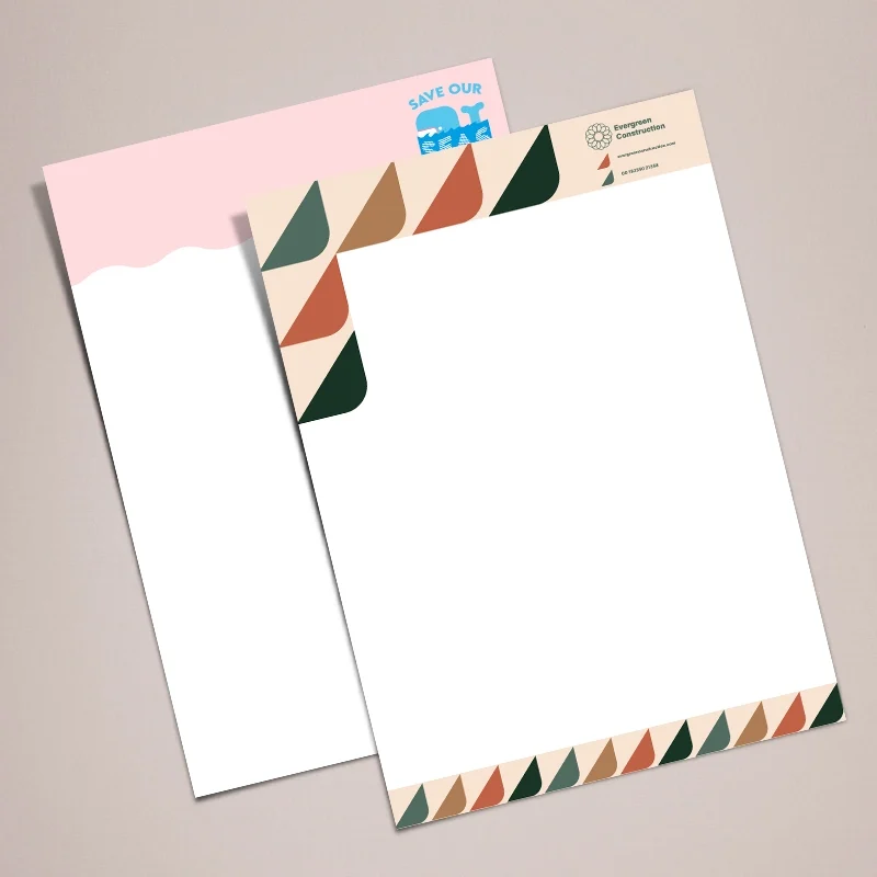
Good letterheads design starts with a clear header holding your logo, business name and contact details, a footer with your registered company details, and a wide clean space in the middle for the letter itself. Keep it to one or two brand colours, use readable type and leave proper margins so it works in any printer.
What a letterhead is for
A letterhead is the printed sheet you write formal letters, quotes, statements and contracts on. It tells the reader who the letter is from, how to reach you and, for a limited company, the details the law asks you to show. It also does quiet brand work: every letter you send looks like it came from the same, organised business.
Most UK letterheads are A4 sheets printed once with the design and then run through an office printer, or written on by hand, for each letter.
What to include
| Area | What goes there |
|---|---|
| Header | Logo, business name, phone, email, website |
| Header or footer | Postal address |
| Footer | Registered company name, number, place of registration and registered office address |
| Optional | Trade body logos, accreditation numbers, social handles, a short strapline |
Our guide to help and buying guides explains the company details in more depth, and a separate post covers letterhead requirements for limited companies.
Layouts that work
Left-aligned header
The logo sits top left with contact details stacked beside it or in a column on the right. It lines up with the left margin of a typed letter, so the page looks tidy, and it is the safest choice for windowed envelopes.
Centred header
A centred logo with details in a single line underneath looks formal and suits solicitors, practices and charities. Keep the line short or it will crowd the top of the page.
Side band
A narrow coloured strip down one edge carries the logo and details, leaving a wide writing area. It is distinctive, but check the typed text will clear the band in your letter template.
Header and footer split
Contact details at the top, legal details in small type at the bottom. This is the most common business layout because it keeps the header uncluttered.
Letterhead ideas that stay professional
- Pick up one colour from your logo for a thin rule under the header or a band at the foot.
- Use a pale tint of your logo mark, large and faint, in a corner. Keep it light so typed text stays readable.
- Print the reverse with your terms of business, a map or a short list of services.
- Match the design across letterheads, compliment slips and continuation sheets so a pack of papers looks like a set.
- Choose heavier paper for a more solid feel. 120gsm feels noticeably better than standard copier paper and still runs through most office printers.
Margins, type and print setup
Keep important text at least 10 mm from the edge of the sheet. If colour runs right to the edge, add 3 mm of bleed around the artwork so the trim does not leave a white line. A typed letter needs its own top margin below your header, so leave around 45 to 55 mm clear at the top of the writing area.
Use one or two typefaces, with contact details around 8 to 9 point and the business name larger. Save your logo as vector artwork or a high-resolution image; a logo copied from a website often looks soft when printed. The artwork guidelines list file types, bleed and resolution.
Common letterhead mistakes
The most frequent problem is a header that is too deep. A logo and four lines of contact details can eat a third of the page, which pushes a one-page letter onto two sheets. Keep the header compact and move the less important details into the footer.
The second is tiny legal text. Company details in 5 point grey type may look neat on screen but are hard to read on paper, so keep them at 7 point or larger in a dark colour. The third is a design that ignores the envelope. If you post letters in window envelopes, the recipient’s address must land in the window, so check where your header pushes the address block before you print a full run.
Finally, avoid dark or busy backgrounds behind the writing area. Typed or handwritten text needs a plain, light page to stay readable, and so does any copy someone makes on an office scanner.
Printing in the office or by us
You can design a letterhead as a Word template and print each letter in full on an office printer, but colours vary and toner can look flat. Pre-printed letterheads give sharp, consistent colour on better paper, and you only print the letter text over the top. A matching set of continuation sheets carries a simpler design for page two onwards.
If you would rather hand the layout to someone else, our design service can set your logo and details into a letterhead and matching stationery.
Questions
What should be on a company letterhead?
Your logo, business name, address, phone, email and website. A limited company should also show its registered name, company number, place of registration and registered office address.
What size is a letterhead in the UK?
A4, which is 210 x 297 mm. Compliment slips are usually DL, a third of A4, so they match the same design.
Can I print letters on pre-printed letterheads in my office printer?
Yes. Pre-printed letterheads are made to go back through laser and inkjet printers. Print a test page first to set the top margin.
What paper weight is best for letterheads?
Around 100 to 120gsm feels better than copier paper and still feeds easily. 170gsm feels premium but suits printers that handle card.
Should the letterhead be printed on both sides?
Most are printed on the front only. Printing the back is useful for terms and conditions or a list of services.